TweetDeck 2013 Makeover

Since the 2011 implementation of TweetDeck, the platform has continued to upgrade and enhance itself. June 2013 saw the addition of the pro tool, the most significant update to the format for years. From a visual perspective, the change is stunning. The early beta versions of the TweetDeck were dark, as designers opted for a black interface with white knockout text. However the new interface is white. This new model is similar to the interfaces of competitors such as Hootsuite and Social Flow.
 Major changes to the menu itself have occurred as part of the makeover, which has now moved from the top of the screen to be situated in a narrow bar in the top left corner which is also expandable.
Previous TweetDecks provided relatively limited icons, yet the makeover has also added a few new icons. This increases the awareness and usability of some of these options, whilst these options also grow depending on the number of added columns and tracked accounts. To demonstrate, each of the “home” icons now represent the main timeline for one of your accounts. Under the changes, a “@” sign will now represent mentions of your account name across the platform. If multiple accounts are registered there will also be multiple “@”s listed. Also, accounts which are tracked will also appear as “@”s.
Any columns which you build based on specific search terms will be listed as a magnifying glass symbol. These are represented as one icon per each search item. In the previous model of the TweetDeck, the columns appeared at the top of the interface as tiny column icons. In order to see the content behind these new menu bar symbols, simply move the cursor over the icon. Alternatively, you can also select the expand icon which is near the bottom left hand corner of the interface. The expand icon enables you to see details of all your menu items.
However even with the new controls it can all get a little confusing. Fortunately, it is likely that you will spend the majority of your time looking directly at your columns as opposed to using the left hand menu.
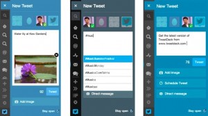
 The new TweetDeck makes it even easier than previously to add new columns. Under the changes, the “Add Column” button has been amalgamated into the left menu which is under the column list. Now you are able to create columns to serve one of nine functions. These functions include: “Activity”, “Mentions”, “Lists” and “Search”. The handy “Search” button situated at the top of the menu bar can also be used to search for keywords, tweets, users and you can also create a new column based specifically on these results.
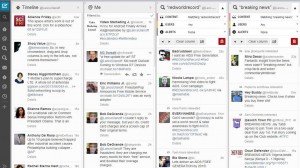
The average TweetDeck is reported to have five columns, although some users can have up to seven or even eight. Under the changes these are incredibly easy to sort. Simply click on the drop down karat of any of your columns, which also provides filter options, then you will be met with left hand and right hand arrows which enable you to move the columns across the interface to your chosen location. The columns also feature a little number which informs you of its position at a glance. It’s these little touches which increase the functionality of the TweetDeck.
Users may initially miss the old colour scheme of the interface. However users can revert back to the old black interface by selecting Settings, then General and finally clicking on Theme.